
Choosing the wrong LED color temperature is one of the most common—and most expensive—lighting mistakes. A warm, inviting bedroom lit with harsh 6500K daylight feels like a hospital corridor. A quality-control station lit with cozy 2700K hides defects your inspectors need to catch.
We’ve supplied LED lighting to residential, commercial, and industrial projects for years, and the single biggest cause of rework and returns isn’t lumens or wattage—it’s mismatched color temperature. The good news: once you understand how Kelvin (K) ratings map to real spaces, the decision becomes simple.
This guide explains what LED color temperature actually is, then gives you room-by-room and space-by-space recommendations you can act on today.
What Is LED Color Temperature?
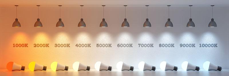
The Kelvin (K) Scale Explained
Color temperature describes how “warm” or “cool” a light source appears, measured in Kelvin (K). Lower numbers (2700K) look warm and yellow; higher numbers (6500K) look cool and blue-white.
Warm White vs Cool White vs Daylight
As a quick reference: 2700K–3000K is warm white, 3500K–4100K is neutral white, and 5000K–6500K is cool white or daylight.
Why Higher Kelvin Looks “Cooler”
It feels counterintuitive, but higher Kelvin values look cooler to our eyes. The scale is based on physics (a heated blackbody), not everyday temperature perception.
CCT vs CRI: Two Different Things
Color temperature (CCT) tells you the tone of the light. Color Rendering Index (CRI) tells you how accurately it shows colors. You need both right—we’ll cover CRI later.
How Color Temperature Affects Mood and Perception
Warm light signals rest and relaxation; cool light boosts alertness and focus. This biological response is exactly why the “right” temperature depends entirely on the space.
How To Choose Color Temperature by Space
Here’s the truth: there’s no single “best” color temperature.
The right choice depends on what you’re doing in the room. You want warm light where people relax, and cooler light where people work, focus, or inspect details.
But before we go room by room, one hard-won lesson from the field. Over the years, we’ve found that mixing color temperatures within a single open space causes far more complaints than picking a slightly “wrong” Kelvin.
A kitchen at 3000K sitting next to a living room at 4000K makes the whole floor look mismatched and cheap. So we tell every client the same thing: lock one color temperature per connected zone, then fine-tune room by room only where walls actually separate spaces.
Consistency almost always reads as “quality”—even when the exact Kelvin is just a matter of taste.
Residential Spaces
You spend your evenings relaxing at home, so warm light usually wins.
Living rooms and bedrooms feel best at 2700K–3000K. This warm white creates a cozy, inviting glow that helps everyone unwind. Go cooler here and the space starts to feel clinical.
Kitchens are the exception. You’re prepping food and reading labels, so we push clients toward 3000K–4000K. Many people run warm ambient lighting overhead and add neutral-to-cool task lighting under the cabinets.
Bathrooms work well at 3000K–4000K. You want light that’s flattering at the mirror but bright enough for grooming.
Daylight (5000K+) can look unforgiving on skin, so most homeowners stop at 4000K.
Home offices deserve 4000K–5000K. Cooler light keeps you alert and reduces eye strain during long work sessions—your afternoon focus will thank you.

Commercial Spaces
In commercial settings, you’re lighting for productivity, sales, and brand image—so the logic shifts.
Offices perform best at 4000K–5000K. This neutral-to-cool range keeps staff alert without the harshness of full daylight. It’s the safe, proven default for open-plan workspaces.
Retail is where things get strategic. Use 2700K–3000K in clothing boutiques, jewelry stores, and bakeries—warm light makes products feel premium and appetizing.
Switch to 4000K in electronics, hardware, or grocery, where you want a clean, “everything’s fresh and modern” feel.
Restaurants and hospitality lean warm at 2700K–3000K. You’re selling atmosphere, and cozy light keeps guests lingering (and ordering that extra course).
Healthcare and schools need 4000K–5000K. Accurate, alert lighting supports concentration and helps staff read charts, skin tone, and detail correctly.

Blue Light, Health, and Safety Considerations
So far we’ve focused on how each space feels. But color temperature also affects how people function in that space—their alertness, their sleep, and in some settings, their safety. This is where the choice moves beyond aesthetics.
How Blue Light Affects Circadian Rhythm
The warm-versus-cool guidance above isn’t only about mood. It’s tied to biology.
Cooler light carries more blue wavelength, which the body reads as a daytime signal that boosts alertness. Warm light does the opposite—it tells the body to wind down.
That’s the deeper reason bedrooms want 2700K and offices want 4000K–5000K. You’re not just matching a look; you’re working with the body’s internal clock instead of against it.
The mismatch matters most in spaces used late into the evening or around the clock, where the wrong Kelvin can quietly disrupt sleep.
Mitigation Strategies for Night-Shift and High-Blue Zones
Night-shift environments create a real conflict. Workers need cool, alerting light to stay safe and accurate, but that same blue-rich light makes recovery and daytime sleep harder afterward.
A few practical ways to balance this:
- Keep cooler light in active task zones, not in break or rest areas
- Use warmer light (around 3000K) in transition and rest spaces
- Shift toward warmer CCT in the final shift hours where safety rules allow
- Use tunable fixtures so one area can adjust as the shift progresses
The aim is to keep alertness where the work happens while limiting unnecessary blue exposure everywhere else.
Safety Benefits of Cool Color Temperature in Industrial Areas
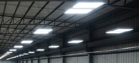
In warehouses, factories, and parking structures, cooler light (4000K–5000K) does more than look “clean”—it improves safety.
Higher color temperature raises perceived brightness and contrast. Edges, labels, hazards, and moving equipment all become easier to spot, which supports faster reactions and safer movement.
In these environments, the alerting effect of blue-rich light is a feature, not a drawback. This is one place where cooler is almost always the right call.
Tunable and Smart Solutions for Mixed-Use Spaces
The room-by-room approach works well when each space has one clear job. But some spaces don’t. A room used for focused work by day and relaxation by evening can’t be served well by any single fixed Kelvin.
You can try tunable and smart lighting.
Common LED Color Temperature Myths
A lot of purchasing mistakes come from beliefs that sound right but aren’t. Clearing up these four myths will help you compare products more accurately—and avoid ordering the wrong thing.
1. “Higher Kelvin Means Brighter Light”
This is the most common misunderstanding, and it’s easy to see why.
Cooler light looks brighter because blue-rich light raises perceived brightness and contrast. But Kelvin measures color, not output.
Brightness is measured in lumens, not Kelvin. A 3000K fixture and a 5000K fixture can put out the exact same lumens—the 5000K just appears crisper.
So when you compare products, check the lumen output, not the color temperature. Choosing a higher Kelvin will not make a dim fixture brighter.
2. “All Blue Light Is Harmful”
Blue light has a bad reputation, but the full picture is more balanced.
During the day, blue-rich light is actually beneficial—it boosts alertness, focus, and mood, and it’s why cooler light suits offices and industrial spaces.
The concern is really about timing and intensity, not blue light itself. Exposure late at night can disrupt sleep, but that’s a matter of using the right temperature at the right time, not avoiding cool light entirely.
The takeaway: use cooler light where alertness helps, and warmer light in the evening. Blue light isn’t the enemy—poor timing is.
3. “Higher CRI Always Looks Whiter”
CRI and whiteness get confused constantly, but they measure different things.
CRI tells you how accurately a light renders colors. It says nothing about whether the light looks warm, neutral, or white.
A 2700K light with CRI 95 renders colors beautifully—but it still looks warm and golden, not white. A cool 5000K light with low CRI may look very “white” while still rendering colors poorly.
So don’t reach for high CRI expecting a whiter look. Use Kelvin to control the tone, and CRI to control color accuracy—two separate dials.
4. “Same CCT Means Same Color”
Two fixtures both labeled 4000K should match perfectly—right? Not always.
This is where SDCM (Standard Deviation of Color Matching), measured in MacAdam ellipses, matters. It describes how tightly a batch of fixtures holds to its stated color point.
A high SDCM value means visible variation. You can install two “4000K” fixtures side by side and clearly see one leaning green and the other leaning pink.
For projects where fixtures sit in the same line of sight, look for a tight tolerance—3-step MacAdam (SDCM ≤ 3) or better. This is a spec buyers often overlook until the mismatch shows up on the wall.
Frequently Asked Questions
Can I mix warm and cool lighting on purpose for a design effect?
Yes—if you do it deliberately.
Intentional contrast works when each temperature has a clear job: warm accent light over a dining table, cooler task light at a nearby workbench. The contrast reads as design because there’s an obvious reason for it.
Problems start when the mix looks accidental. If you’re layering temperatures on purpose, make the difference strong and intentional so it looks planned, not like an ordering mistake.
Does dimming an LED change its color temperature?
It depends on the fixture.
Standard LEDs hold their color as they dim—a 3000K light stays 3000K at full output or at 20%. Some premium fixtures use “dim-to-warm” technology, which shifts warmer as you lower the brightness, mimicking a traditional incandescent bulb. Research on lighting and circadian health from Harvard Health is one reason warm, low evening light is often preferred at home.
If you want that warming effect when dimming, specify “dim-to-warm” by name—it isn’t automatic.
Do color temperature preferences vary by region?
Yes, and it matters for export projects.
Cultural and climate expectations differ from market to market. A warm tone that feels premium in one region can feel dim or cheap in another, and commercial norms vary too.
If you’re specifying for a multi-region rollout, confirm local preferences early. Assuming one standard fits every market is a common—and avoidable—mistake.
How do I verify a fixture’s actual color temperature before ordering in volume?
Don’t trust the label alone—ask for test data.
A reliable supplier can provide photometric and color test reports showing measured CCT, CRI, and color consistency for that exact product. The Lighting Facts label approach shows how measured performance can differ from marketing claims.
Requesting a sample and reviewing the reports before a bulk order takes minutes—and prevents the most expensive lighting mistakes.
Conclusion
Choosing LED color temperature really comes down to one question: what happens in the space?
Warm light (2700K–3000K) for relaxing, neutral light (3500K–4100K) for balanced tasks, and cool light (5000K+) for focus, safety, and inspection. Lock one temperature per connected zone, then confirm the specs—CRI for color accuracy, SDCM for consistency—before you commit to volume.
Ready to put this into practice? Have a try.
Source Your LED Lights From RC Lighting
RC Lighting researches products with quality guaranteed—so you can match the right color temperature, CRI, and consistency to every space without worrying about mismatched batches.
If you’re planning a project, it’s our pleasure to help you get the specs right the first time.
Contact us for a quote or request lighting fixture samples to see the quality for yourself—and get excellent products at competitive prices, backed by good service.